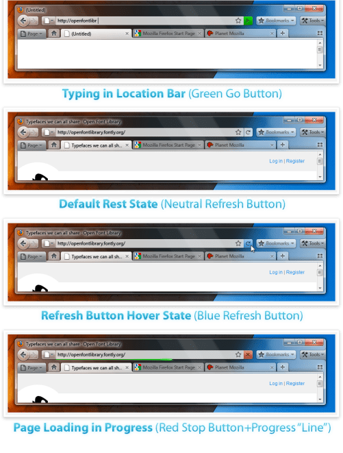
As first reported on Neowin, We have the new/proposed designs for Firefox 4 with some shiny and glassy appearance. The Screenshots itself are looking great. These designs are just proposed ones and they may or may not be there when the final version is released. The designs show firefox is doing work to make it fit well with Windows 7 layout and appearance.
Version A – Tabs-on-Bottom

Version B – Tabs-on-Top

The more contentious Tabs-on-Top concept.
Positives
- Save Vertical Space
Efficiency/Remove Visual Complexity – Right now the tabs have to be connected to something. So we are adding an extra visual element for them to connect to.
Shorter Mouse Distance to Page Controls
Negatives
- Breaks Consistency/Familiarity – Moving things confuses existing users.
Title is MIA – With the space removed from the titlebar you only get the truncated version in the tab.
Longer Mouse Distance to Tabs – Takes longer to mouse to a tab.
Lost Space – Sandwiched in between the application icon and the window widgets you lose some space.
Combo Stop/Refresh/Go Button.

Take a look at them. I think they look great. So , how many of you use firefox like me?
